BLOG
Keep Customers On Track to Checkout with Progress Bars from Yieldify
Published: Jan 16, 2018

Great onsite experiences keep your customers engaged and on track to checkout. Today, we’ve launched a new way to help you do just that.
Your customers are always on the look out for the best deal. In fact, a big reason why 69.23% of online shoppers abandon their cart is because they’re hunting for the best deal on the same or a similar product elsewhere.
So how do you fight this? There’s a lot you can do to your website to curb bounce rate, but if you’re going to consistently keep your customers from straying offsite, you’re going to need the right tools to engage them throughout their user journey.
A powerful new way to do this is to show a progress bar delivered by the Yieldify Conversion Platform.
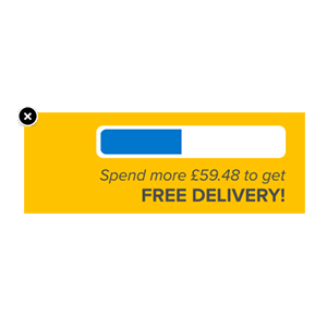
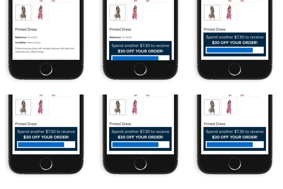
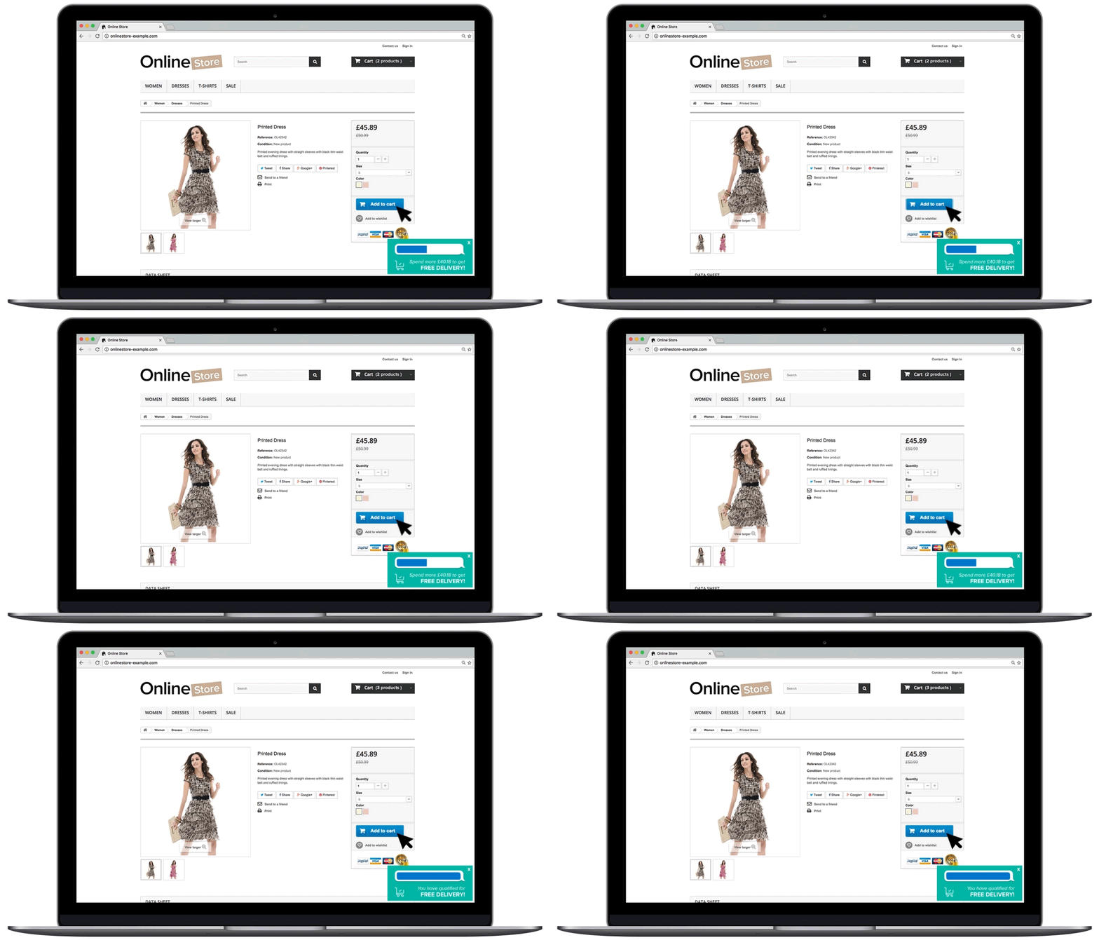
Progress bars visualise how close a customer is to unlocking your onsite offers. The latest in a series of new smart content types available from Yieldify, it’s an inventive tactic you can use to optimise the customer journey.
Check out this video to see progress bars in action:
Encourage higher order value
You can motivate customers to check out with a higher-value basket by showing them a persistent visual of their progress towards unlocking an onsite offer. This is particularly effective when combined with a Dynamic Promotion which shows how much more a customer would need to spend to qualify for your onsite deal. It’s a great way to potentially increase average order value.
 Visualise progress to offers to curb abandonment
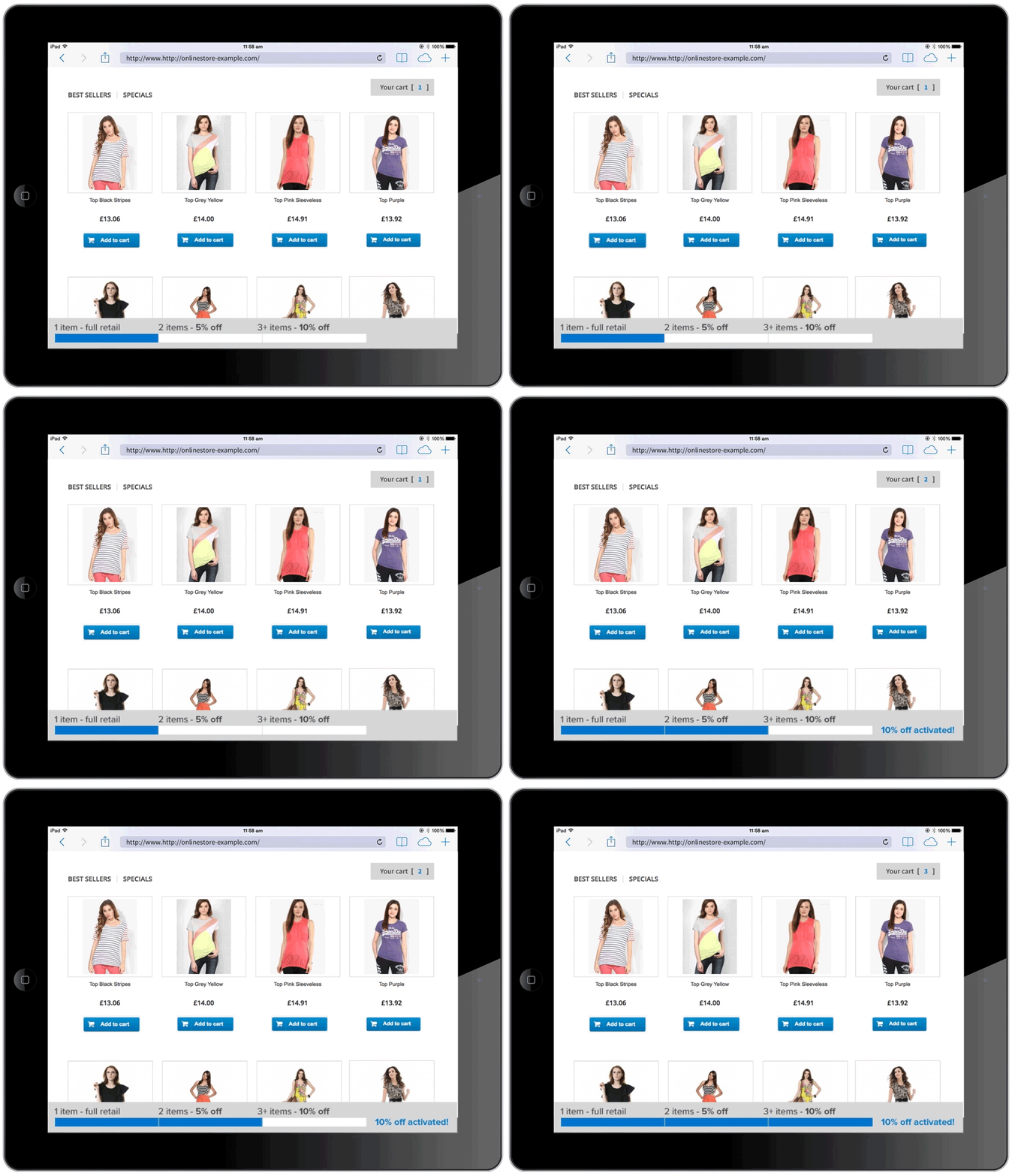
Failure to show costs transparently leads customers to ditch websites – 24% abandon their check out because they can’t calculate order value in advance – but increasing the visibility of your onsite offers can boost conversions. We’ve seen higher conversion rates and order values when customers see multi-offer progress bars that shows all the available discounts and their required thresholds.

Enrich the customer journey
A progress bar can be a neat way to add to the customer journey, optimising it for conversion. By showing a subtle bottom bar or corner notification, you can engage customers with a relevant message without interrupting their shopping experience.
