EBOOK
E-commerce A/B Testing
Published: Nov 14, 2018
E-commerce A/B Testing: An Introduction
In the history of marketing, there’s never been a better time than now to learn what makes your customers tick. Surveys and focus groups used to be the only way to get to the heart of what your customers were thinking – and then you’d put your advertisement on TV or on a billboard and hope that it made enough of an impression that people would buy.
In the digital age, e-commerce marketers have an unfair advantage – a superpower, even. It’s been shown to improve the bottom line and allows you to iterate until you create the perfect call to action, subject line or sign-up offer. But here’s the thing: 84% of marketers are not using it.
We’re referring, of course, to testing. Yes, in e-commerce A/B testing can be tricky. Yes, it can be time-consuming. But with huge rewards to be gained, why not accelerate your conversions instead of stabbing in the dark? In this guide, we’re taking you through the why, when, where, and how of testing.
Why is Testing Important
Given that more than one-quarter of marketers are not satisfied with their conversion rates, there’s a clear need to improve. Yet when we asked marketers about the tools and strategies they’re using to accomplish this and optimize the customer journey, only 16% selected A/B testing (sometimes called split testing), and even less (5.9%) are running multivariate tests (MVT).
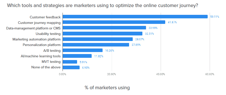
Continuous improvement and analysis is a cornerstone of a successful e-commerce marketing program – allowing you to make decisions based on scientific data, learning constantly about what makes your customers click, sign-up or buy. It allows you to zero in on elements of the customer journey and optimize the key touchpoints, conversions and micro conversions by showing the right message to the right person at the right moment, all of which is knowable with good data.
Before we go any further, it’s important to note the variations between different kinds of testing. A/B testing is one version of an element against another, while MVT (multivariate testing) tests multiple subtle changes on a single web page, to see how different elements interact with one another.
A/B testing is perhaps the better known and easier to manage, especially if you’re new to testing (since you’re only comparing one version against another), and also requires less traffic. Because multivariate tests have (surprise) more variables, the technique is best used on highly trafficked sites in order to get meaningful results. In this guide, we’ll focus more on A/B testing since it’s easier to get started with.
What Are The Challenges With E-Commerce A/B Testing?
Now, the reason why the majority of e-commerce marketers aren’t testing is, frankly, that it’s difficult. Setting up the test conditions, getting the right tech in place, measuring and analyzing results can take a back seat to the more pressing concerns of ‘business as usual’ marketing. Here are a few of the questions and concerns marketers have:
E-COMMERCE A/B TESTING: STARTING WITH THE RIGHT HYPOTHESIS
Just like any other scientific experiment, testing should start with a hypothesis. For example, “I think our customers will prefer a discount to VIP access”. Start with an educated guess based on your customers’ behavior and then test how accurate it is. However, starting with the wrong hypothesis – one that’s not based on how your customers are currently behaving – could lead you down the wrong path and give you results that aren’t worthwhile.
E-COMMERCE A/B TESTING: HOW LONG TO TEST
According to Neil Patel, the master of testing, you should run a test for at least several days in order to get significant results. According to him, “As a rule, you should test for a minimum of seven days, make sure you’ve reached statistical significance, and then test for another seven days if you haven’t.”
While a lot of e-commerce marketing is based on quick turnarounds, it’s worth planning ahead to allow your test to gain good traction.
E-COMMERCE A/B TESTING: THE RIGHT TECH
One of the things stopping a lot of marketers from running detailed and useful tests is that many of the touchpoints available for testing are hard-coded into the website. This means that running a test on whether the CTA button is orange or purple requires not only marketing, but also design and development to get involved, and it’s at this point that many marketers file it away as ‘too difficult’.
However, some technologies are built to facilitate easy and fast testing, so if you’re considering onboarding a new marketing tool, make sure that this is one of your assessment criteria.
E-COMMERCE A/B TESTING: WHERE TO TEST
So you’ve decided to run some tests. Great! But when you can literally test everything on your website, email marketing, social advertising and checkout process, how do you even decide where to start? Before you get overwhelmed with the choice available, it’s time to go back to your customer journey map (or, if you haven’t got one, create one and then go back to it).
What you’re looking for is the key touchpoints and conversion points to identify your priorities. For example, you might see a point in the journey where users are dropping off – say, your checkout funnel. Something needs to be fixed here, so don’t just go with your gut and change it, take a systematic approach and test your hypotheses.
E-COMMERCE A/B TESTING: AUDIENCE SIZE
If you’re testing smaller audiences, your results will be unreliable and won’t be worthwhile, so make sure you’re testing on a larger audience to get statistically significant information (see our tips section below for more about statistical significance).
E-COMMERCE A/B TESTING: WHEN TO TEST
While optimization through testing is ideally an ongoing process, peak season can also be an ideal time to run a series of tests. While it’s tempting to leave things as they are during important trading periods, busy times will give you more information, more quickly, meaning you get your results faster and get valuable learnings for the following year.
Consider running a test if…
- Your website has at least moderate traffic volumes (over 50,000 monthly visitors)
- Your targeting is broad
Don’t run a test if…
- Your website has low traffic volumes (fewer than 20,000 monthly visitors)
- or your targeting is very narrow
E-COMMERCE A/B TESTING: WHAT TO MEASURE
Just as there are a range of things you could be testing, there are also many things you could be measuring: micro and macro conversion rates, clicks, sign-ups and average order value. Anywhere that users aren’t acting as you’d like them to is a good place to start – or look at where you’ll likely see the biggest impact, such as preventing cart abandonment.
E-COMMERCE A/B TESTING: HOW TO MEASURE
Ensure your data capture is set up so it’s easy to compare results – and implement the findings or iterate on them for the next round of testing. Here’s an example from the Yieldify Conversion Platform of how you might record your A/B test results so that you can make informed decisions based on the results:

What Should You Test?
Like we said earlier, testing is a secret superpower that most marketers are ignoring. By running a systematic and well-planned series of tests – and, crucially, by implementing the results you find – you can improve ROI on marketing spend, reduce customer acquisition costs and ramp up your conversion rates. Here are some examples of elements of your marketing that you can easily test:
E-COMMERCE A/B TESTING: DIFFERENT MESSAGES
Different calls to action will generate different results from your audience. If you need to get to know your audience to find out what their priorities are, this is a perfect opportunity. For example, they might be the kind of people who will happily increase their basket order in exchange for free shipping but may not be as tempted by a VIP club.
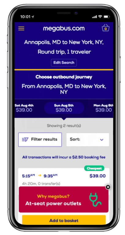
Travel company Megabus wanted to target booking abandonment at the top of the sales funnel. At this crucial point in the customer journey, they ran an A/B test against a control to see whether highlighting USPs would work to decrease the abandonment rate, with some users being served a ‘Free Wi-Fi’ message, and others seeing ‘at-seat power’. With both of those messages decreasing abandonment and increasing conversion rates, further testing uncovered the more effective messaging, leading to a 3.2% uplift in conversion rate.
It’s worth taking your time and calculating the cost-benefit of running different kinds of messaging. Perhaps people will happily take a 10% discount over a mailing list ask, but are only really interested in discounted purchases – meaning that money is walking out the door without the customer longevity. But if the mailing list sign-up CTA is still quite effective, perhaps that discount doesn’t need to be offered, saving you money and growing a great list of warm leads instead.
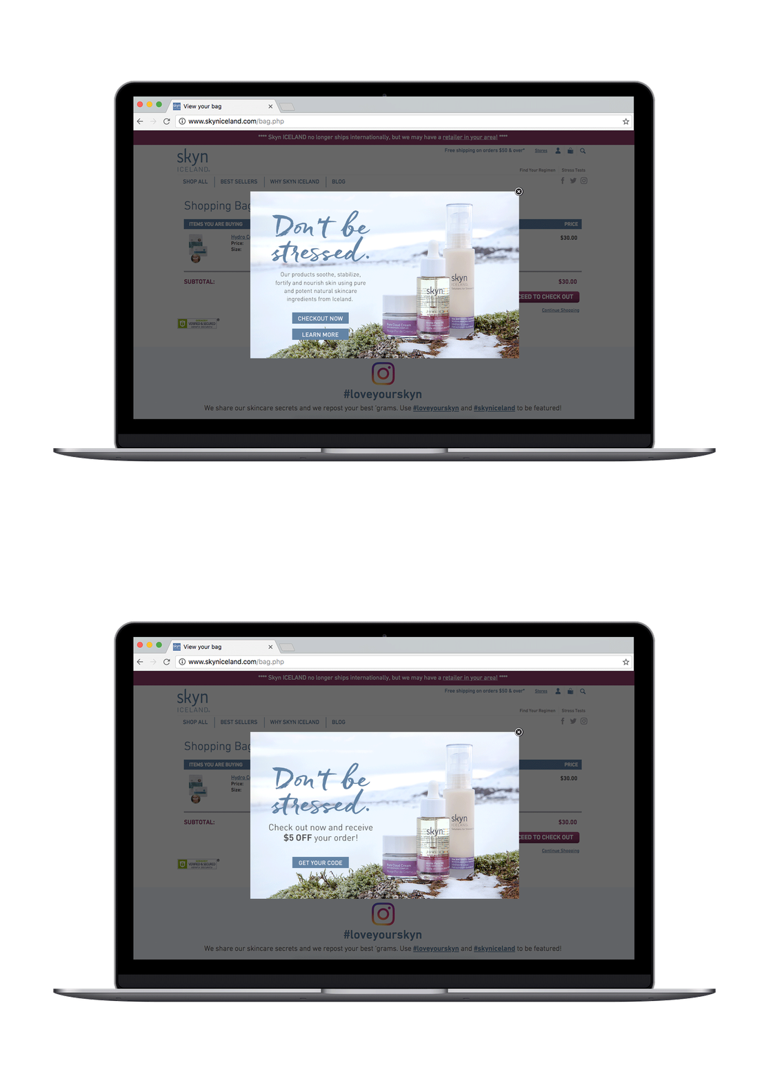
For example, Skyn Iceland found that a message targeting the USP of the brand was more effective than one offering $5 off, with the USP-driven messaging creating a 28.87% uplift in conversion rate.
E-COMMERCE A/B TESTING: DIFFERENT COPY
Perhaps you’ve determined that your customers are happy to join the VIP list – so how exactly should you word the call to action? Are your customers more motivated by savings or exclusivity? By “Buy now” or “offer ends soon”? There are a million different versions you could try, so start with your best hunch, or employ some tried and tested psychology.
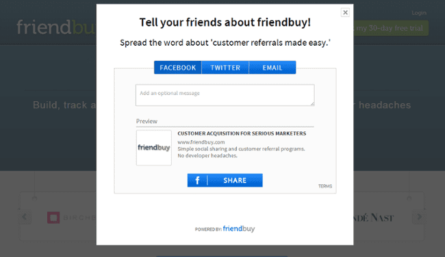
Software company Friendbuy realized its call to action wasn’t working as well as it should, hypothesizing that the copy was complicated and indirect:
So they did a split test against the control group:
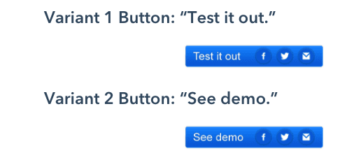
It was found that Variant 2 had a 211% improvement over the control group, compared with Variant 1, which only had a 71% improvement. They concluded that Variation 2 was well defined, clear, and was what people were expecting.
E-COMMERCE A/B TESTING: DESIGN
There can be a lot of focus on testing copy, but don’t forget the visuals! This is particularly important if you sell design-focused or aspirational products, like fashion, beauty or travel destinations. Again, given that testing should ideally be an ongoing activity, testing out different images and different copy will give you huge insight that you can apply to future campaigns.
Other design elements you can and should test are color, font, static vs. video image, font size, composition and button placement.
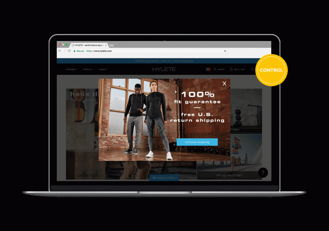
Activewear brand Hylete tested out video content versus static imagery in a campaign designed to reduce cart abandonment. With the knowledge that 53% of consumers want more video content from marketers, the brand developed the hypothesis that their audience would react better to video content. Testing proved this correct – video drove a 42.2% uplift in conversions.
E-commerce A/B Testing Tips
One of the reasons people avoid testing is that there are a few common pitfalls. Here are some of the ways you can avoid getting caught out.
E-COMMERCE A/B TESTING: STATISTICAL SIGNIFICANCE
If you’re running a test, that’s a great start. But, as MarketingSherpa found, 40% of marketers don’t calculate statistical significance when running experiments. It’s essential that you reach 95% statistical significance in your testing activity, otherwise, your data won’t be worth making decisions on. Hubspot offers a statistical significance calculator along with other resources that will tell you whether you’ve got reliable data or not, and Analytics Toolkit offers an in-depth guide to interpreting your data accurately.
E-COMMERCE A/B TESTING: USE A CONTROL GROUP
A/B testing might be a slight misnomer, as you will usually be testing two alternatives against a control or baseline group – so there are actually three versions of a page in play. The control group is a population which is not being exposed to something new: they’re the group that sees your website as-is, while your A/B testing group is seeing two new variations. The control is essential for proving your hypothesis.
E-COMMERCE A/B TESTING: ALWAYS REMEMBER THE PURPOSE
Put a goal in place before launching your test: improve lead generation, decrease cart abandonment, get more conversions at a specific touchpoint. That way, you can measure your success against how well you’ve reached your goals, and then move on.
Conclusion
Testing is a core practice of digital marketing, no matter the channel, in order to get the most out of your marketing campaigns. While there are a few challenges as we’ve discussed, regular testing becomes much easier if you’ve got the right technical and strategic support in place.
With data from over 200,000 Yieldify campaigns the services team at Yieldify use these benchmarks, combined with in-depth analysis of the customer journey on our clients’ websites to develop testing hypotheses and roadmaps. This is then carried out via the A/B testing capability of the Yieldify Conversion Platform, to ascertain what resonates most with visitors at different points in their journey.
Book your free consultation with the team by clicking below!