EBOOK
How to Reduce Bounce Rate
Published: Sep 28, 2022
What you’ll get from this guide
If you’re getting the traffic you need but seeing lots of visitors leave without doing anything then you need to reduce your bounce rate.
The official definition of bounce rate given by Google Analytics is:
A bounce is a single-page session on your site. In Analytics, a bounce is calculated specifically as a session that triggers only a single request to the Analytics server, such as when a user opens a single page on your site and then exits without triggering any other requests to the Analytics server during that session.
‘Bounce rate’ isn’t always – as some believe – when visitors leave immediately after landing on your page. While your bounce rate will include those people, it will also include those who spend some time scrolling or reading your landing page – they just don’t click deeper into the site.
And that means that there’s an opportunity here.
In this guide, we’ll unpack the four key areas where improvements can help reduce bounce rate – and how to figure out which one applies most to your website.
Diagnozing Your Bounce Rate Problems
So what constitutes a ‘high’ bounce rate anyway? A cross-section of e-commerce businesses using Magento had an average bounce rate of 46.3% across the period of the study (although the rate fluctuated dramatically during the sample period).
Design agency Rocket Fuel has created a graph aggregating 60 of their clients’ bounce rates and also indicating what’s normal and what should be raising red flags:
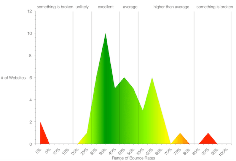
If you find yourself in the higher than average range – or even if your bounce rate is around average – there’s probably a lot you can do to reduce bounce rate and recapture that lost potential revenue. But where do you start?
Before you make any changes, you need to first understand why your bounce rate is higher than it should be – and that means analysing visitor behavior. Jump into your analytics tool (whether it’s Google Analytics or something similar) and follow this methodology to get started:
- Start by comparing your bounce rate and your exit rate (that is, the percentage of visitors for which this page was the last in their session) for key pages, such as homepage, landing pages and product pages.
- If both the bounce and exit rates are high, this could indicate that there’s something wrong with the particular page, such as design or user experience. Your solutions will therefore come from sections 3, 4 or 5 of this book.
- If only the bounce rate is high, it could indicate that there’s a disconnect between where the traffic is sourced from and what you’re presenting on the page.
- If you see the problem in (3), cut your data again based on where the traffic is sourced from in order to determine whether that’s the case. Your solution may therefore come from section 2 of this book.
Acquisition-stage Fixes to Reduce Bounce Rate
Whether or not a visitor will bounce begins long before they even land on your site – a high bounce rate can be a sign that your acquisition strategy is misaligned. Once you’ve broken down your bounce rates by traffic source, you can consider the following two options:
Are you looking for visitors in the wrong places?
Sometimes your product or brand just won’t appeal to some visitors, and that’s fine. For example, if your target audience is retirees but a large amount of your marketing spend is taking place, say, on Instagram – where only 8% of users are over the age of 65 – you may need to revisit your marketing strategy and make sure that the traffic you get is qualified and primed to buy your products.
Similarly, if you’re using display marketing or email marketing, make sure that your referral traffic is originating from lists and sites that are aligned with your product and demographic targets. It’s difficult to get demographic information about your bouncers, but it’s worth checking that your placement and messaging are appealing to the right people.
Is your landing page out of alignment?
One of the most important factors in crafting an effective landing page is ensuring that the result matches the query. In other words, when visitors enter your site, they should be getting what they’ve been promised. If your bounce rate is high, it could be because people enter your site expecting one thing and getting another – even if it’s a slight difference.
That could be that the advertisement they clicked doesn’t lead to the right product landing page. Or for example, that you’ve advertised plus-sized clothing, but the plus-sized items are out of stock. It could also be a mismatch of pricing expectations, or that your company doesn’t ship to the visitor’s location or speak their language.
If there’s a disconnect in how you’re pitching your product, being savvy and specific in how you talk about it, ensuring there’s complete continuity between acquisition marketing and on-page experience. This can help reduce your bounce rate and keep visitors away from your competitors.
User Experience Fixes to Reduce Bounce Rate
Regardless of where your visitor has landed from – whether it’s social media or from elsewhere in your site – a poor user experience is nearly guaranteed to reduce both bounce rates and exit rates. As yourself these questions to see how can you can improves yours…
Is your landing page well-designed?
This is a big one, but it’s very important. Most retailers understand the paramount importance of creating a well-designed website that’s easy to navigate. But others, well… Not so much:
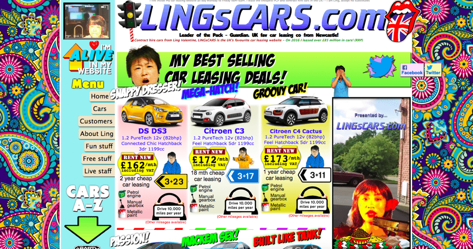
An off-putting design that’s difficult to navigate, with distractions like intrusive adverts or difficult-to-read colour schemes will almost guarantee a high bounce rate. Remember: if your site makes the user work to explore your products, sign up to your mailing list or buy something, users will be unlikely to stick around to try.
Your e-commerce retail site design should feature:
- High quality product images
- Clean design that directs the viewer’s focus towards the call to action
- Consistent branding with colour and logos
- Easy-to-read fonts
- Colour-blind legibility
- A fully optimized mobile version that’s easy to navigate and make purchases on
Clear call-to-action
If someone has clicked on a paid ad to reach your site, they’ll be primed to expect a certain thing from your landing page.
They’re ready for action, so that action needs to be very clear.
Is it a pop-up offering a discount if you sign up to the mailing list? Perhaps it’s a call to browse the collection or to buy a specific item. Whatever the CTA is, it should nudge the visitor in the direction of either a micro or macro conversion. A secondary call to action – perhaps to engage with customer service – should be less conspicuous in order to avoid confusing your visitor.
For example, the landing page of watch company Linjer included a highlighted bar at the top with a small CTA to back its latest design on Kickstarter, but it doesn’t detract from the simplicity of the landing page’s main calls to action:
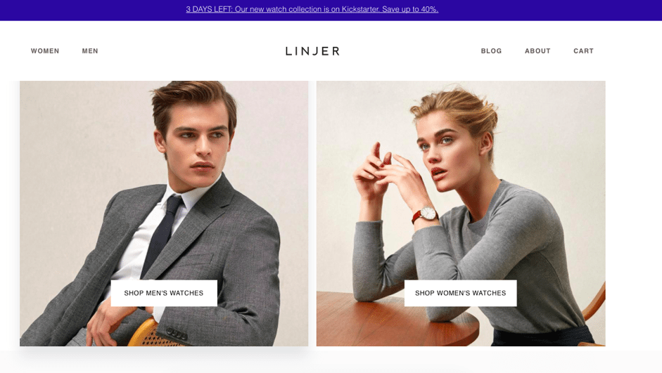
Having too many conflicting calls to action can be confusing and ultimately off-putting, so it’s important to select your primary call to action and make sure your entire landing page is oriented towards that.
Is it easy to sign up to your list?
If you’re capturing registrations or email addresses, it’s essential that there’s a low barrier to entry. Make sure that you’re not creating a gateway to your products or interrupting the user experience: sign-ups should be given willingly, not under duress.
This is a similar principle for the checkout process – the thing standing in the way of your conversions could in fact be you.
Are you delivering a customer-specific experience?
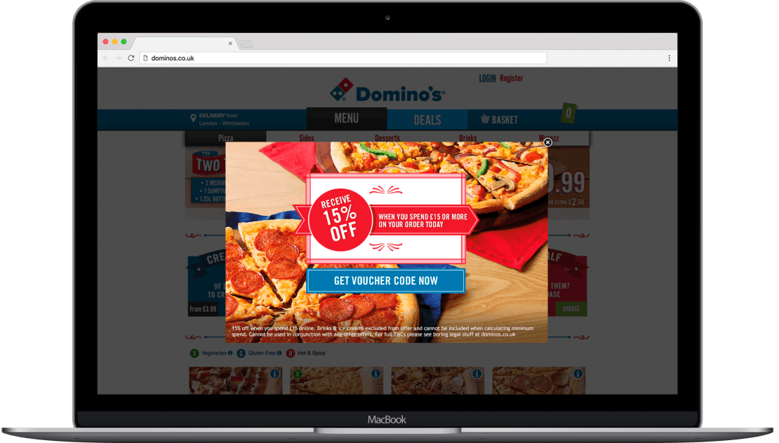
Personalization is an incredibly powerful marketing tool that you can use on your site from the moment people arrive – for example, you can distinguish new visitors from return visitors, and serve them different offers and content based on their level of previous interaction with the site. It’s essential here to use analytics in order to learn about individual customer journeys.
Take this example from Domino’s Pizza, who differentiated between its new and returning customers to trigger tailored incentives in order to convert them:

Content Fixes to Reduce Bounce Rate
If your user experience is clear and you’re delivering what your user expects but still seeing a high bounce rate, it may be time to look at your content.
Is your copy of a high quality?
Your landing page copy needs to be persuasive, of a high quality and legible. It needs to be clearly laid out so that it’s skimmable and easy to read, since most people won’t read everything on the page but do want to be able to pick out key points.
To achieve this, any written copy must:
- Be relevant to the customer’s needs
- Use the appropriate keywords naturally
- Have short sentences and paragraphs
- Have subheadings
- Have short, snappy sentences
- Be free from spelling and grammar errors
This is also good SEO practice, so you’ll also be improving organic traffic by sticking to these guidelines.
Tempting though it may be to use fanciful, flowery language it’s usually wise not to. If visitors are looking for something specific, a descriptive keyword that they would use to search for that item is always the best choice for product names, URLs and descriptions.
For example, your navigation bar should use clear titles to group and categorize products, and your product titles or collections should be recognizable at the reading age of a 9-year-old (the UK government’s content guidelines suggest this reading age to improve readability and accessibility).
Do people trust you?
If people are going to browse your website with the possibility of parting with their hard-earned cash in mind, they need to feel assured that this is a genuine and credible e-commerce business and that their details are safe.
There are many elements of your website and branding that must work together to establish trust, but one of the most important is to include a trust mark to show that you’re an authorized retailer, not a scam. Another way to establish trust is to incorporate user ratings and reviews – from sites like Trustpilot – to demonstrate that you have genuine, happy customers.
Technical Fixes to Reduce Bounce Rate
With every change you’ve been able to make from a content and marketing perspective, you can shoot yourself in the foot if your pages don’t perform from a technical perspective. Time is of the essence – here’s what you need to consider to make sure that your visitors stick around…
Does your page load fast enough?
A lengthy page load time is a famous traffic killer.
According to Kissmetrics, if an e-commerce site is making $100,000 per day, a 1 second page delay could potentially cost you $2.5 million in lost sales every year.
Why? Because people just aren’t willing to wait while your website loads: if they’re interested in the item, they’ll look elsewhere. The website could be amazing, but if it doesn’t load within 2 seconds or less, 47% of users will simply leave.
To test your page’s load time, use Pingdom or Web Page Test. If you’re finding that it’s taking longer than two seconds, a few of the ways you can improve your page load time include:
- Reducing image sizes by saving for web in your image processing program
- Upgrading hosting
- Minifying HTML and CSS
- Limiting the number of redirects
- Utilising GZip compression
- Minimising the number of plugins on your side
Does your page render in a timely fashion?
Page loading and page rendering may seem very similar – and they are – but rendering time refers to the amount of time your site takes to be functional. Load time refers to the time it takes to load images and code, while rendering is the time it takes to process all those elements and ready them for interaction with visitors. Time to test, test, test.
Is your site optimized for mobile?
According to Rocket Fuel, you can expect that your bounce rate on mobile will be about 10-20% higher on mobile than on desktop. However, with 34.5% of retail e-commerce now taking place on a mobile device, it’s essential that retailers pay close attention to the mobile experience and optimize pages for the increasing number of consumers browsing on mobile.
Conclusion
You’ll never eliminate bounces completely (in fact, according to Rocket Fuel, a 0-15% bounce rate indicates that something’s broken), but with smart analysis and progressive improvements you can reduce your bounce rate (and hopefully boost your conversions along the way).
As with every update to your website, the key is to do your homework first – making changes without a clear hypothesis as to why you’re doing it is a quick way to waste time and potentially do unnecessary damage. If you need help conquering bounce rates and abandonment, feel free to schedule a demo with our sales team. We’ll help get you started.