EBOOK
E-commerce design & the customer journey
Published: Apr 10, 2019
UX & UI best practices for e-commerce marketers
When it comes to e-commerce design, the expectations of today’s consumers are high. A browsing experience that is smooth, clean, easy to use and pleasant to look at is now a basic standard for the average internet user. Nowadays we seek out (sometimes subconsciously) the most intuitive and user-friendly experiences we can, so it’s vital that e-commerce websites keep up with this consumer
As online spending continues to rise and the wealth of options for consumers diversifies, consumers will buy (and come back to) those that can provide the most seamless customer journeys. Central to this is the customer
Lana Kropyvna, Head of Design, Yieldify
“People buy with their eyes. If something doesn’t look good, users won’t be interested in it – end of story. There’s a furious competition online for everything, so good design is the key to a successful user journey.”
UX and UI design: what’s the difference?
When it comes to website design and creating this successful user journey, there are two disciplines to consider. Website design is split, broadly speaking, into these areas of focus: UX and UI. Their functions are distinct, but they could never really be described as fully separate from one another – truly great website design relies on the UX and UI working in harmony to provide the consumer with everything they need.
UX stands for User Experience. In the simplest of terms, this is the functioning core of the website – if your online store was a human body, UX works like the muscles to keep things moving as they should. To this end, it’s obviously vitally important to have great UX across your website – with poor UX your customers’ journeys will be fractured and frustrating, and may drive them away to better functioning websites.
UI stands for User Interface. This includes much of the more visible elements of design on your website. Again, if your store was a human body, UI would be its face. The way your website looks, and the ways your customers can interact directly with it (or be interacted with) is determined by your UI design.
Tied together, great UX and UI design will help to perfect the customer journey – but if one of the two factors isn’t up to scratch, it will always be immediately noticeable to your customers. No matter how great a website looks, poor UX design will make it difficult to use. Alternately, your website might run like a dream, but with poor UI design your customers won’t know where to look or where to click to find the information they need.
Creating an intuitive website through UX and UI design is imperative, then. A study by Magnetic North found that one in three people will abandon a purchase because they can’t find the information they’re looking for on the website. Similarly, 75% of consumers admit they judge a websites credibility on its design, and 42% simply won’t purchase from a poorly designed website. What’s clear is that consumers can be pretty ruthless when it comes to e-commerce website design.
This guide will show you how to ensure your site avoids the pitfalls of bad e-commerce design, by demonstrating best practice for how your website should look and function at every stage of the customer journey. We’ll show you the do’s and don’ts of UX and UI design considerations to help you face down the challenges marketers face in creating intuitive, functional e-commerce sites.
Arrival: homepage design
For many of your online visitors, the homepage will be their first impression of both your website and your company as a whole. Here is where you need to demonstrate not only that your e-commerce site has exactly what the visitor is looking for, but also that they aren’t going to have to battle against bad design to get it. Demonstrating all this just through the impact of your homepage is no small feat, but there are plenty of ways to do it.
Part of making a strong first impression is highlighting why visitors should buy from you. Effectively communicating this information on your homepage is the first step toward luring in potential customers. Let’s take a look at an example:
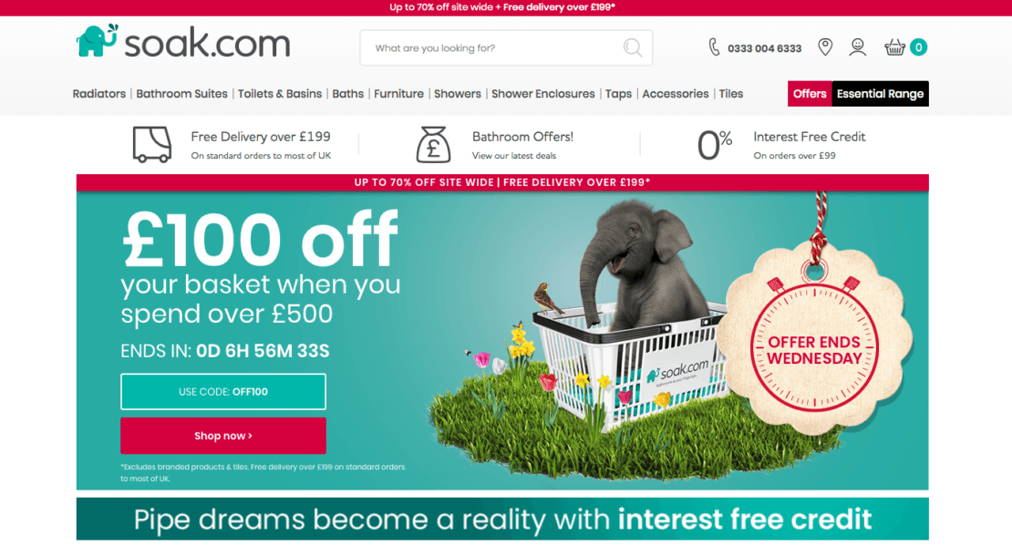
This is the homepage of bathroom retailer soak.com. If you think about a bathroom, it’s a relatively big ticket item to buy online, so right up front soak.com uses a number of tactics to assure visitors that finding and buying their perfect bathroom won’t be as difficult as they think. The brand highlights a mix of USPs, such as free delivery and interest-free credit, alongside seasonal special offers.
Hero images are a useful way of alerting people to the core messages you want them to take away – in this case, the last few hours of a special offer. One way that Soak.com takes full advantage of its hero image is to include a countdown timer, letting visitors know how much longer they have to take advantage of the deal. Using animation subtly, such as in a countdown timer, is an excellent way of providing a user-friendly experience i.e. adding value, by communicating important information, whilst also driving urgency.
Perhaps most important though is the use of a hero image at the very center of the landing page. Hero images are large images that are generally the central focus point on a website – the first big visual element that consumers see and are drawn to.
Soak.com also makes great use of its branding from other channels on the homepage, such as Tully the elephant (the star of its TV ads!) so even visitors arriving from offline advertising will be sure to know they’re in the right place.
E-commerce design can be tricky when it comes to homepages, do you introduce your USPs, show off your flagship product or focus on seasonal promotions as in the example above? This is where you might want to consider how website personalization can help. Personalizing the homepage for different visitor segments doesn’t have to involve a lot of heavy lifting, it could be as simple as utilizing a notification or overlay to differentiate between new and returning visitors, and provide them with relevant information.
For example, train operator Stansted Express utilized a corner notification on its homepage to highlight the USP of being the fastest route to central London. This was targeted at visitors who had not yet entered the booking
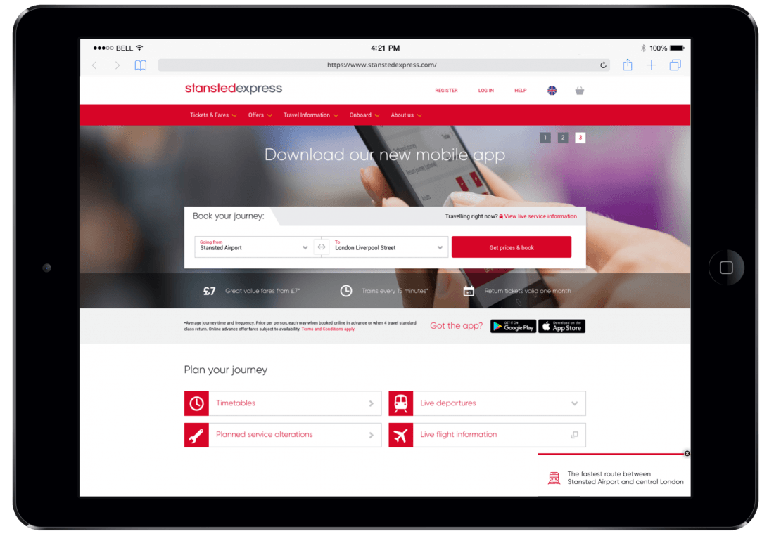
The key to your arrival page is to provide clear messaging – as well as directing customers to focal points that the brand wants them to see, both of the above examples have easy and recognizable navigation features on their homepages. Each shows a selection of categories that can be clicked on to narrow down the products available to precisely what the customer is looking for and a very easy to find
Homepage e-commerce design essentials:
- Above all, be clear!
- Make use of eye-catching, on-brand imagery
- Highlight your USPs (and test to see what works best)
- Personalize based on visitor segment
Discovery: navigation and category page design
The search functionality of your website is a key part of your UX design. The Baymard Institute found that search support is designed poorly with such frequency that when they asked survey participants to complete product finding tasks using e-commerce search functions, 31% of attempts ended in failure.
In fact, the same study found that of the top 60 e-commerce sites 70% were unable to return searches that used synonyms that didn’t match their own chosen descriptors, and 34% failed to return results when product numbers or search queries were typed in with a single error. While on-site search is not only a problem for design
First up, make your search function obvious if that’s how your customers prefer to find products (and 50% probably do!) In the previous examples we’ve covered soak.com pre-populates its search box with a question ‘what are you looking for’ to encourage users to interact, and Stansted Express provides a drop-down of all possible routes, alongside a CTA that makes it clear what the results of the search will be (prices and the ability to book).
Another way to help visitors in finding what they’re looking for, aside from
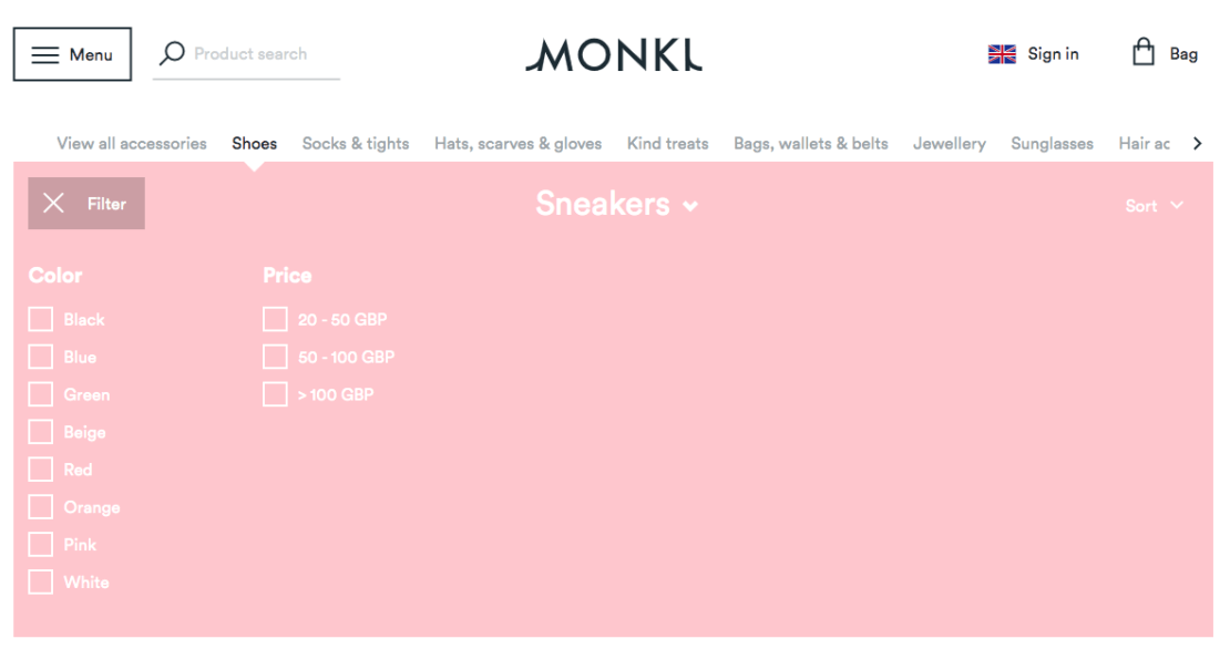
Thread, whose entire concept is built around being an online store that makes recommendations based on your established tastes, takes this idea even further. Thread’s search filters allow customers to highlight specific categories within their search, as well as other factors like brands and sustainability – allowing vegan customers to avoid products featuring leather or silk.
More impressive still, customers can mark whether they like or dislike each search result. A ‘liked’ result will be remembered and featured near the top of relevant user searches. A ‘disliked’ result will allow the customer to choose exactly which features they don’t like and have other products with similar features pushed down future search results.
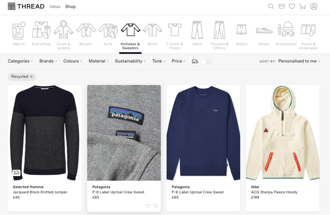
Aside from getting smart with filters, another way to assist your visitors when it comes to navigation is by understanding their behavior. For example, maybe they’re dwelling on a particular page, and can’t find what they’re looking for, or maybe, based on their behavior, you know they’re looking for gifts. A corner notification, triggered on scroll or timer, asking users how they want to shop is a great way to take visitors to curated or high performing sections of your site. In the example below, Swedish retailer Fyndiq combined this with a seasonal Valentine’s campaign to direct users toward gifts for him, her or friends:
Navigation and category e-commerce design essentials:
- Get smart with filtering, make it easy and logical for the user
- Consider a sticky navigation bar to keep the filter options at hand
- Recognize where visitors are getting stuck, and offer assistance
Selection: product page design
Once your customer has discovered an item of interest to them, they’ll find themselves on a product page. As ever, it’s important that the design is well thought out and enables them to find all the information they need with the minimum amount of effort. Remember that customers who have arrived at your website through advertisements or in-article links will frequently arrive directly at the product page, so maintaining accessible navigation tools is still very important!
Information should be at the forefront of any product page’s design. The customer has come so far as to show intent – now they want to focus on the specific details that will help them decide whether or not to purchase.
Activewear retailer Sweaty Betty offers a clear and concise set up on their product pages that nonetheless hits all the right notes:
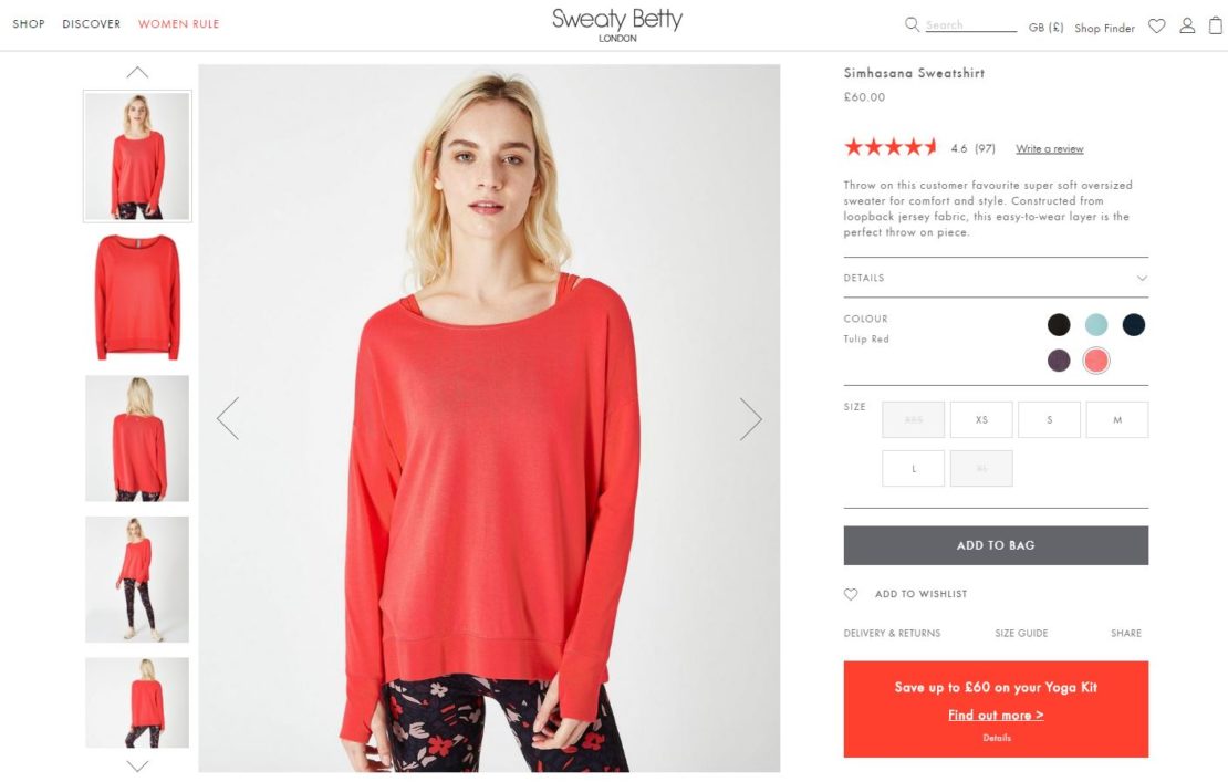
There are a number of high-quality images of the item that can be clicked on, or scrolled through easily. Many products include a video so visitors can see how the clothing looks and moves in action. Information about the product is presented clearly, and the average rating given by previous purchasers is a great way to instill confidence through social proof. The site also makes product choice an easy process, offering a selection of colors and sizes, and fading those that are not currently available. These are the basics of good UI design, ensuring an entirely intuitive experience for consumers.
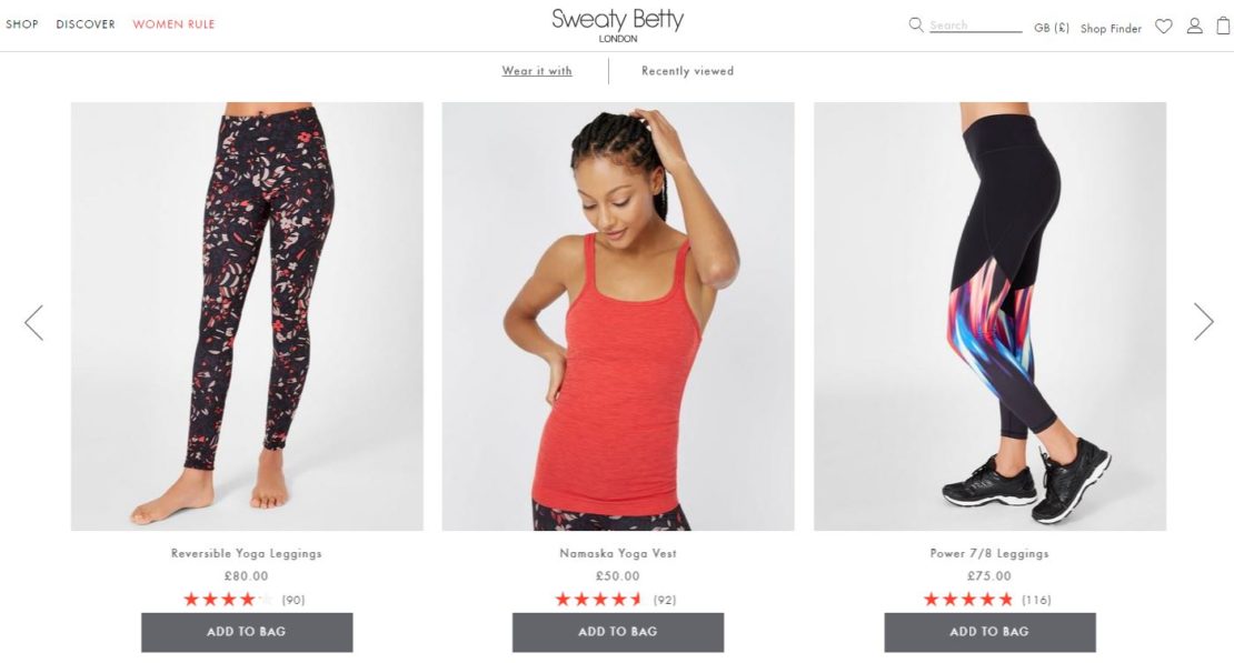
Further down the page Sweaty Betty utilizes the space below the product details to provide further value to the visitor – a selection of items that complement this particular product, and a ‘recently viewed’ tab that shows other items the customer has looked at, allowing for easy comparison and consideration (and the ability to add each item to their basket without leaving the page).
The ability to include personalization in-page is very often what raises good e-commerce design to great e-commerce design. By tailoring the page to each customer you are able to present a more relevant and more useful experience that can make all the difference. Here’s an example:
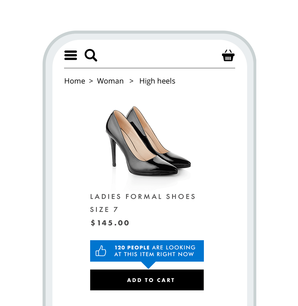
Not sure which bit we’re talking about? That’s exactly the idea. The In-Page Personalization element here is the ‘120 people…’ social proof flag in blue – it has been added in a matter of minutes and will only appear on the site’s most popular products, even then only materializing after the user has dwelled for a few seconds. To the user, it all looks seamlessly like part of your site, for the marketer it ensures the small screen real estate on mobile is used in the most effective way to drive conversions.
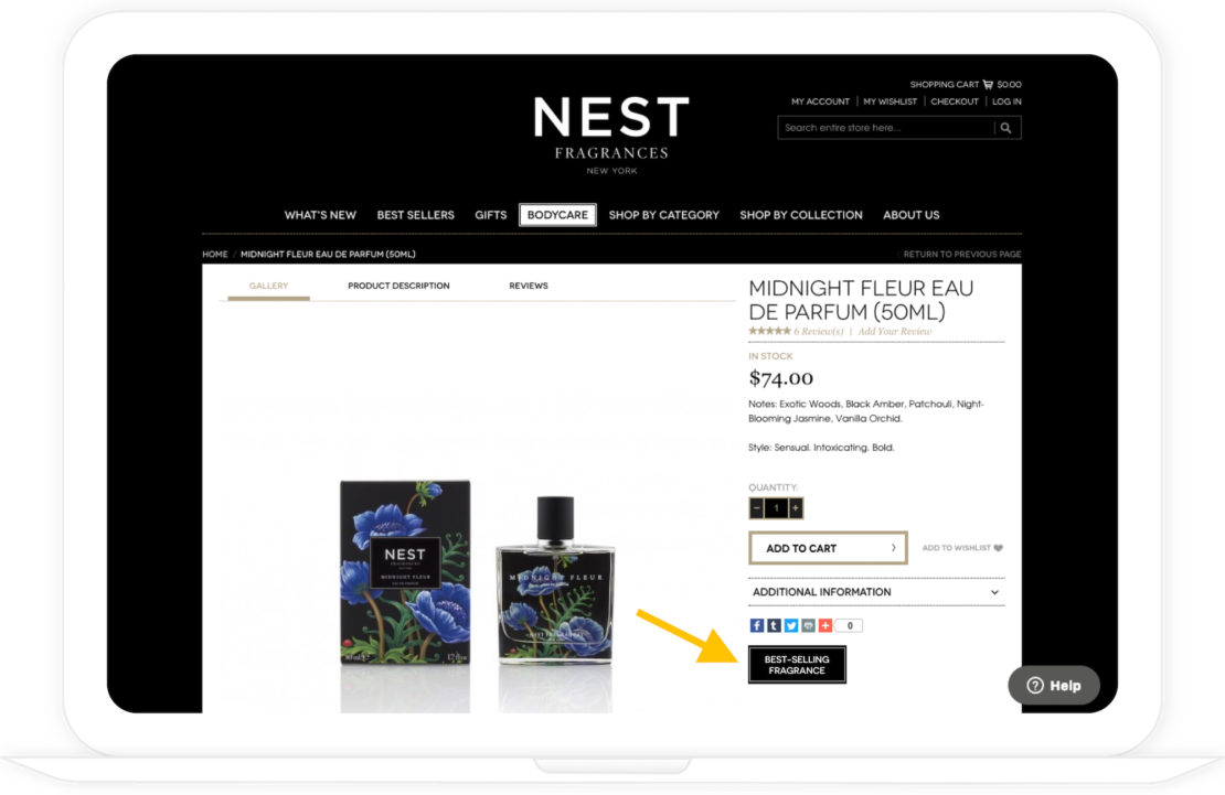
Here’s another example from NEST Fragrances. A similar concept has been used to showcase ‘bestsellers’, which is also part of NEST’s filtering categories onsite, by utilizing a free area of white space on the product page. Mirroring the message the user has seen throughout their journey is a great way to build confidence that they’ve chosen the right product – this example led to a 30% uplift in conversion rate!
Product page e-commerce design essentials:
- Use high-quality imagery (or video!)
- Communicate important information like shipping deadlines or cost
- Cross-sell and up-sell with relevant recommendations
Conversion: cart and checkout design
There’s no more frustrating a loss for an e-commerce business than that of a customer who has made it all the way through to the checkout, only to abandon their purchase at the last moment! But this happens all too often. There are plenty of reasons for this – sometimes the process is too long and muddled (a UX issue), too busy and complicated to look at (a UI issue), and sometimes the customer just doesn’t have faith in the safety of their card details or the credibility of the site they are dealing with. There are fixes for all of these problems.
Travel is an industry that suffers particularly from the issue of cart abandonment, due in part to the often lengthy booking funnel, as well as the fact holidays are often high value, high consideration purchases. A visitor who enters into the booking funnel, however, is showing high intent, so how can you encourage them to complete this process via great design?
Great design is all about great communication, and this is especially true when it comes to e-commerce design. So one way to solve the issue of abandonment within travel is to set visitor expectations at the appropriate point in the user journey. Tour company Leger Holidays sought to do this at different points along the booking funnel utilizing In-Page Personalization:
As users complete the form, they are made aware of how long is left to go in the process, encouraging them to continue on their journey. What’s good about this example is that the information is presented in context – anchored to the relevant section of the form, but without interrupting the visitor journey. To date, the results have been impressive, with conversion rates up by +15.7% versus the control group.
An interesting recent development when it comes to this stage of the customer journey is Instagram’s new checkout feature, which allows customers to buy products on the social media platform without having to leave the app itself. The ease that this affords customers is obvious and echoed by the app’s clean checkout process as seen below, and there are a few things that e-commerce brands would do well to add to their own site, particularly when it comes to mobile.
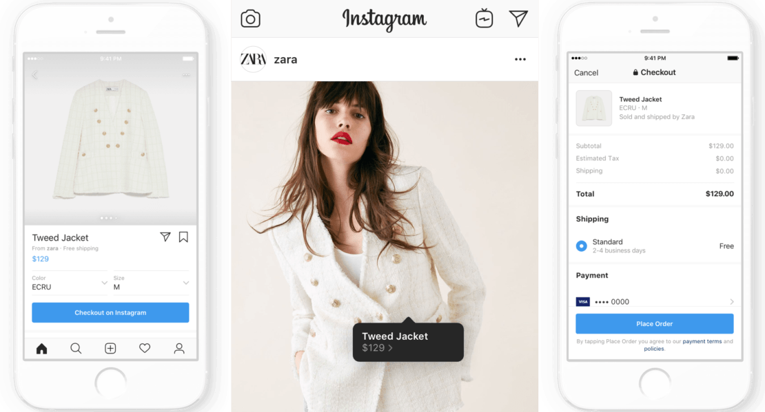
The selling points as Instagram tell it are: simplicity, convenience and security. Users don’t need to log in and enter their details multiple times (often a barrier to conversion, particularly on mobile), and the payment options available, such as PayPal, are well known and mobile-friendly.
One crucial area where Instagram might fall down is trust, given ongoing issues with how its parent company, Facebook, handles consumer data. A lack of trust can be a hugely disruptive factor in the checkout process and with consumers more aware of online security than ever before, highlighting your brand’s reputation and security is one of the best ways to counter these fears.
Cart and checkout e-commerce design essentials:
- Use trust symbols and well-known payment providers
- Keep it simple, especially on mobile
- Communicate clearly around form completion
Post-Purchase: customer experience e-commerce design
Of course, once your sale is completed that shouldn’t be the end of your customer’s journey with you. In many cases, the delivery is still to be made, and of course, you’ll always want to encourage the customer to return for another purchase in the future. There are a few ways to make sure the ongoing customer experience is catered for in via your e-commerce design.
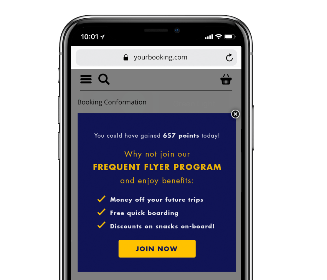
Pop-up notifications when arriving on a website are a common way to encourage account or mailing list sign-ups, but can feel like a frustrating obstacle to users who already have accounts – that’s why it’s important to personalize your lead generation efforts, and think about what information you want to ask for, or give to, returning users . It might be to encourage them to sign-up for your loyalty program, with a post-purchase
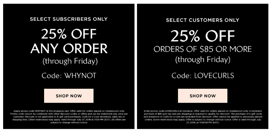
Or it might be giving them a special offer the next time they visit, based on purchase frequency, as shown below from beauty brand Ouidad. The
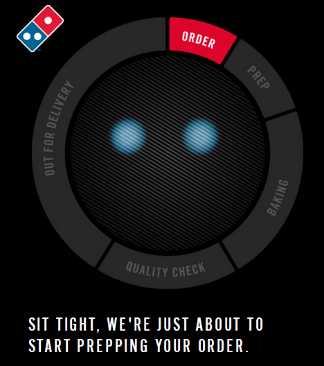
Or it might be, for those awaiting delivery, a tracking process. This can be utilized whether the item is likely to take a few days to arrive, like clothing, books or other goods, or likely to arrive in half an hour so, like takeaway pizza.
Domino’s pizza tracker that kicks off the moment you order your pizza and gives an estimate about where in the process of getting to you the pizza currently is. It’s a useful tool that helps the customer feel as though they’re being cared for and looked after even though the purchase itself has now been made.
Post-purchase e-commerce design essentials:
- Showcase your loyalty program to drive memberships
- If you don’t have a loyalty program, you can still tailor offers based on behavior
- Think about how you can best communicate delivery tracking information
Conclusion
Your website should be built and designed so that it is always considering the customer journey. From the moment visitors arrive until well after their purchase has been made, there are opportunities to make a smooth and intuitive experience that ensures visit after visit. Above all, seek to provide a clean and easily navigable experience, incorporating personalization to help create a customized experience for every visitor. Get it right and you will not only secure the