EBOOK
How to Create the Perfect eCommerce Checkout Process
Published: Sep 14, 2017
What you’ll get from this guide
Are you in one of the 22% of businesses that’s satisfied with their conversion rate? If so, you can stop reading here. And congratulations, by the way.
However, if you’re in the 78% of businesses who feel there’s room for improvement, strap in to find out how to optimize your eCommerce checkout process to increase conversions (even the satisfied 22% will probably learn something).
According to data, for every $91 spent acquiring customers, only $1 is spent converting them. That’s a whole lot of marketing spend sinking into the void: Getting customers onto your website means nothing if they don’t also buy.
There are three big hurdles along the way:
- Getting your customer to engage with a product and add it to cart (i.e. defeat browse abandonment).
- Getting your customer to make it to checkout (i.e. defeat cart abandonment).
- Getting your customer to make it through the final checkout gauntlet to purchase (i.e. defeat checkout abandonment).
In this eBook, we’re talking about step three – e-commerce checkout abandonment. Fail at this stage and your success in the last two will count for little.
You don’t have to be re-building your e-Commerce checkout from scratch to get value out of this – some of the most impactful changes can actually be incredibly simple. So dig in – you’re sure to find challenges (and their solutions) that you recognize. Ready? Time to check out the checkout!
Getting the right mindset
Technically there’s no single eCommerce checkout process that’s perfect. In fact, part of what makes it so tricky to get right is that the ideal eCommerce checkout is unique for every business, depending on your market, demographics, product, brand, competitors, and a whole host of other factors.
This is why – as with all things eCommerce – you need to start by looking closely at your customer.
Your checkout needs to be an experience that works around them, to suit your goals. You’ll, therefore, find that this guide works around the customer, too. Our Consulting team has categorized the six most common reasons that customers abandon checkouts – and the abandonment solutions to prevent those problems.
This means that all you have to do is see what applies to your site and work from there (if you’re not sure, skip to the last chapter of this guide for tips on how to accurately identify what issues are causing your customers to abandon checkout).
1. Comparison shopping: “Can I find this cheaper elsewhere?”
How to spot it
Three behavioral indicators can be signs that your customer is abandoning to comparison-shop:
- They reach the page where the final price is shown (i.e. after viewing the cart, delivery step or summary page) then show exit intent, or exit after showing some engagement.
- They select and copy the name of a product in their cart.
How to solve it
It may be tempting to believe that, if you have competitors offering a similar product or service at a cheaper rate, the battle is lost unless you lower your prices.
However, discounting is not a sustainable solution, and you have plenty of other alternatives to keep your customer in your e-commerce checkout funnel:
- Dispel the idea that better offers are out there: promote USPs such as price guarantees, free delivery, or free returns.
- Create urgency: use social proof to move your customer to purchase by showing that lots of other consumers are buying (which means it can’t be a bad idea), or show your delivery cut-off thresholds for express, next or same-day delivery.
- Incentivize with an offer: this is more aggressive and may, therefore, be something to restrict to a particular segment of customers such as new visitors, first-time customers, or at-risk customers – it’s up to you and what your margins can handle.
Case study
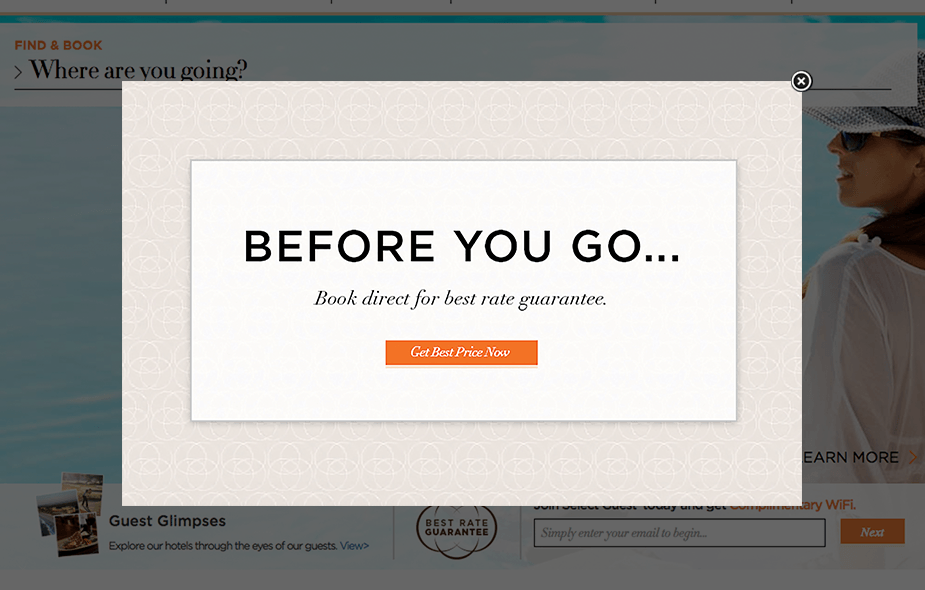
Omni Hotels and Resorts, a chain of hotels across North America, found that users abandoned to look at hotel price comparison websites. All they had to do was show that their direct rates were the best in the market and they saw a 39.09% conversion rate uplift:

2. Cheapskate-ing: “I bet I can find a discount code”
How to spot it
The behavior here is similar to “Can I find this cheaper elsewhere?”, and distinguishing between the two will depend on whether you accept promo codes, how regularly you promote them, and how prominent your promo code field is.
How to solve it
If your customers are leaving to look for a discount, it’s better to offer the discount yourself rather than risk them not returning to their cart. Therefore, you should:
- Dispel the idea that better offers are out there: just as you did with your price-comparison shopper, make sure you clarify that your shopper is already getting the best possible deal.
- Provide a code on exit or at another point during the funnel: once a user leaves, there’s no guarantee that they’ll return to your site and make the purchase, whether they find a code or not. Catch them before they go.
Case study: Reducing eCommerce checkout abandonment
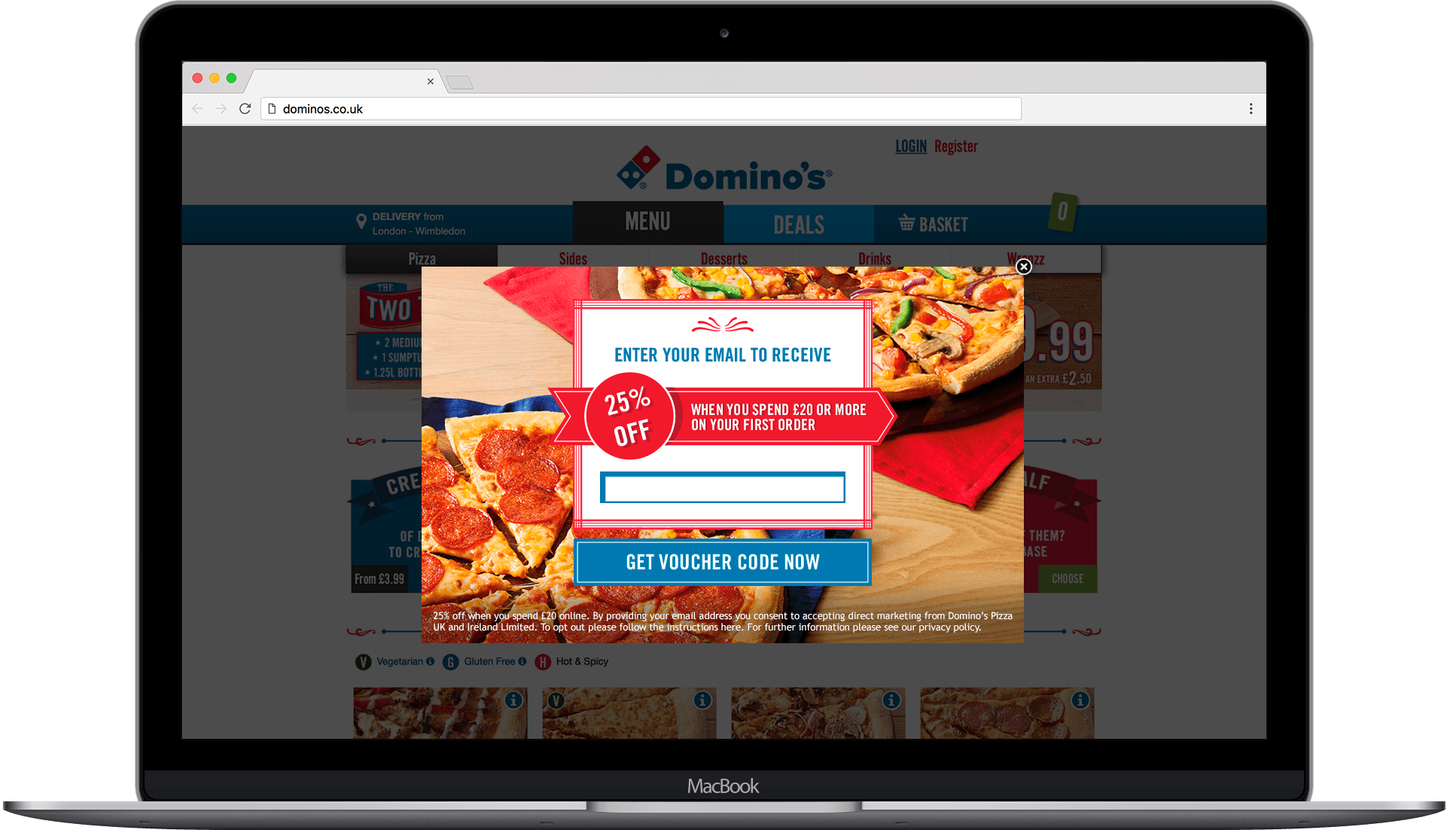
For Domino’s Pizza, a brand with wide market recognition, there is an expectation of what the price of the product will be. But like many takeaway brands, it’s also known for deals and discounts, so the availability of a promo code is also an expectation – not to mention that the input box for the code is a featured part of the checkout.
In order to lessen the number of people leaving the site to find discount codes, Domino’s implemented two campaigns focused on its e-commerce checkout.

One offered first-time customers a 25% discount on exit, while the other targeted returning customers with a different discount offer depending on the value of their basket. This saw a 13% uplift in conversion rates for exiting visitors, plus a 9% increase in average order value from visitors who saw a campaign.
3. Commitment issues: “Let me get a second opinion before I decide”
How to spot it
For bigger purchases, or cases where a switch in service provider might be in play, customers may want to consult with a partner, friend, or colleague before buying. This behavior can be detected in:
- Extended dwell-time on the cart or summary page.
- Multiple views of the cart summary page followed by exit.
How to solve it
Rather than urging the visitor to buy now – risking an unhappy customer – there are a number of ways you can encourage users in this situation to return to a cart:
- Enabling the ability to save a cart, flagging this function either within the funnel or in a follow-up email.
- Allow users to share their cart via email or social media.
- Promote your returns policy to reassure uncertain shoppers that they can change their minds.
- Send an email summary of the cart (they can then forward this on to another person).
- Promote trust symbols, delivering a ‘second opinion’ from thousands of other consumers.
Case study
OVO Energy, a new energy company, aims to get people who are overspending on their current energy bill to switch providers. However, switching energy providers is a big decision that often seems complicated (which is partially why so many people stick with unfavorable deals).
To overcome this, Ovo targeted people appearing to get cold feet – that is, dwelling in the switching funnel – with an overlay promoting Ovo’s outstanding Trustpilot score. This move resulted in an 18% uplift in conversion rate.

4. Procrastination: “I can do this later”
How to spot it
One of the dangers for eCommerce checkouts is the process appearing too long, discouraging people from seeing it through. Again, once someone leaves the process, there’s no guarantee that they’ll return to it, even if they had intended to.
This impulse can be identified if someone starts the checkout process, moving beyond the cart page but does not interact with the form or interacts with a few fields before abandoning.
How to solve it
This solution may involve either content and messaging tweaks or some technical changes to the checkout process:
- Promote ease of completion – state how long it usually takes to complete the process (or how many steps there are). This can be bolstered by demonstrating to your customer how far they’ve progressed in it, increasing their feeling that they’ve invested in the process and making them want to see it through.
- Highlight (or add) easy checkout methods such as Apple Pay, Amazon Pay and Paypal (especially important on mobile). Many businesses only show payment methods in the footer or leave them until the payment page where somebody has many opportunities to leave before seeing them.
- Create urgency: use social proof to move your customer to purchase by showing that lots of other consumers are buying (which means it can’t be a bad idea), or show your delivery cut-off thresholds for express, next or same-day delivery. This also helps with dissuading price-comparison behavior.
Case study
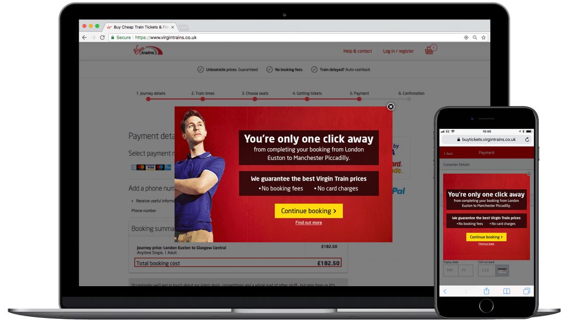
Virgin Trains targeted abandoning customers at several points in the booking funnel with overlays highlighting how close they were to completing the booking. This responsive messaging resulted in a 16.6% conversion rate uplift at the point of payment.

5. Confusion: “What do I do now?”
How to spot it
This issue can take the form of customers either not knowing how to proceed, or not knowing what details to enter. This is particularly common for financial services, which will sometimes require very specific information to be entered. The customer might display:
- Extended dwell on form pages such as details, delivery or payment, having engaged with most or all of the other form fields.
- Progression through the form but dwelling on a specific field.
How to solve it
Using analytics tools, pinpoint the stumbling block that’s causing people to falter. When the desire to complete is there, it can be especially frustrating for users who are unable to progress. Here’s how you can help:
- Review your copy and instructions. Is there anything that’s unclear or could be misinterpreted? Add prompts and extra information if necessary.
- Offer support either online or through another channel such as a call center or live chat if available.
- Deliver a clear progression CTA showing your customer what to do next – the next step may not be obvious to all users.
- Promote FAQs or troubleshooting pages to help your customer answer their own question before they leave your site.
Case study
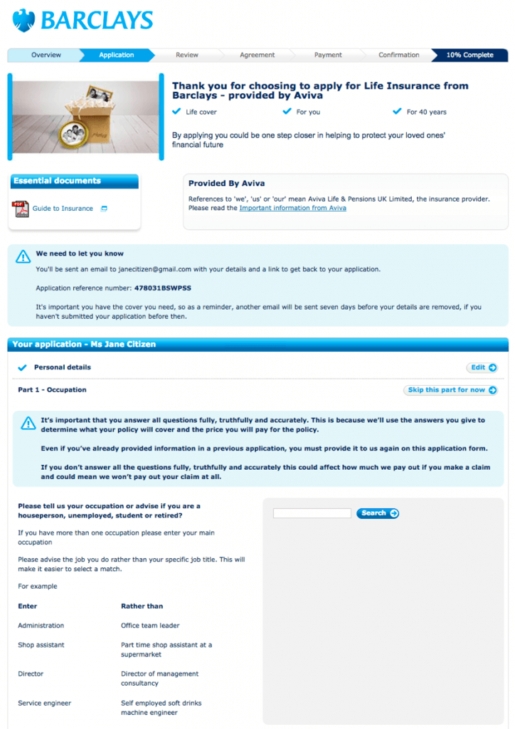
With a need for some very specific details in order to tailor a quote for life insurance, Barclays’ application process includes prompts for each field, with a hover-over instruction to unobtrusively offer information about information is needed and why.

Below, for the requirement to enter an occupation, specific instructions and examples are given about what information to provide, assisting the customer in easily filling out the application.
6. Lack of trust: “Is this site secure?”
How to spot it
The question of whether your payment process is secure is a very common concern – the behavior that it results in can be hard to distinguish from that of shoppers who would rather just buy in-store or over the phone. Both of these abandoning shoppers can be identified by exiting from the payment or summary page, having interacted with payment options.
To understand exactly which of these is happening on your site, you’ll need to form a hypothesis and then test it by tweaking your messaging.
How to solve it
This is an issue that may be trickier to navigate since it’s based on gut instinct rather than on straightforward financial motivations of saving money. In fact, as recently as 2015, 85% of customers still preferred shopping in a physical store.
To combat this, you should:
- Highlight trusted payment methods and trust badges.
- Incorporate reviews and other social proof examples.
- Offer a chat window or phone number so customers can ask questions.
Case study: Building a trustworthy eCommerce checkout
Secured by Norton, Symantec’s trust symbol (formerly VeriSign), has been found to be the most recognized trust symbol in the world, with a reported 81% of users recognizing it.

Hotel and flight booking engine Opodo reported a 10% sales to increase within a week after adding a VeriSign symbol, while virtualsheetmusic.com reported a 31% increase in revenue after the symbol was reinstated following a lapsed contract.
How to identify your checkout issues
You’ve seen a number of different behaviors in this guide that serve as your key indicators as to the intent behind your customers’ abandonment of the checkout funnel. But how do you accurately identify them on your site?
In order to understand why people are leaving their carts, you must first conduct a funnel progression or abandonment analysis to uncover data on aspects of the funnel such as:
- Distribution of average time spent on page.
- Overall average time to complete the checkout process.
- Field depth by page.
Add to this your qualitative observations, such as when a customer will see the total cost. Heatmapping tools can add to this insight.
Gathering this data and analyzing it should tell you a lot about how people behave inside your funnel, and where, when – and hopefully why – users drop out of your checkout process.
Once you have an indication of which of our key six problems your checkout is facing (or even, which combination of them), you’re poised to start testing your changes.
Conclusion
If, as indicated by the Baymard Institute’s aggregated statistics, up to 8 in 10 baskets are abandoned, a lot of revenue is going down the drain for eCommerce businesses.
By paying attention to your checkout funnel, diagnosing your issues, and considering your checkout process from a customer-centric position, you can take simple but effective action to reduce the revenue lost at the final hurdle.
It’ll take analysis, testing and problem-solving to reclaim that revenue, but having acquired the traffic and engaged it, think of this process like you’re a customer approaching the very end of the e-commerce checkout funnel – you’ve come this far, why let the last hurdle get you down?
Ready to turn more browsers into buyers? We can help you identify the areas for improvement in your e-commerce checkout process, and get your visitors across the finish line. Click here to book a consultation with the team.