BLOG
How We Took Yieldify’s Branding to Infinity and Beyond
Published: Jan 10, 2019
In late 2018, we took a look at what we’d achieved as a business. Over 1,000 clients, an award-winning platform and 30 billion datapoints. We’d come a long way.
The problem was that the way we communicated ourselves was lagging a little bit behind. It was time for a refresh of our brand.
Starting the rebrand project
First things first, the message.
Over a year ago, Yieldify began talking about Customer Journey Optimization – we’re proud to be flying the flag for this exciting new practice. In writing extensively about it in that time, we’ve come to learn just how much it resonates with marketers in e-commerce and beyond.
For example, a report we published in late 2018 found that more than 70% of marketers understand the customer journey, but optimizing it still presents challenges. In 2019, we’re looking at a landscape where CJO rises further up through the agenda and starts to becoming an established practice for marketers.
Our challenge was to see whether we could push this further and bring CJO to the marketers who’d never heard of it. We wanted to do this by connecting it to another concept, one much more widely understood and recognised in the market: personalization.
To make CJO easier to understand, we decided to bring personalization directly into our messages. In a nutshell, we now described CJO as ‘personalization across the full customer journey’. In other words, if personalization is a tactic, CJO is a strategy that makes use of it from A-Z.
So in crystallizing our messaging in order to build a visual identity on top, we created a new tagline that would encapsulate this in a simple soundbite:
“customer journeys made personal”
With personalization and CJO now firmly knitted together, we had a solid verbal identity that orbited the idea of the journey. This spoke not just to the kinds of customer journeys that our clients’ customers would take, but the journeys that our teams take our clients on as we help them navigate the new challenges of e-commerce.
We knew that we were looking for amplification and enhancement rather than a complete revolution – our message was being taken to the next level, rather than changed.
Now we could start thinking about how we would translate this visually.
Creating a new logo
It’s arguably the most important piece of a brand identity – or it’s at least the one that everyone notices first. Our logo was over five years old and badly in need of updating for Yieldify’s new phase.
Once again, we started with the journey: we wanted our new logo and icon to convey the idea of progression and movement. The arrow element the formed part of our former logo had done this, but it needed a cleaner and more flexible execution.
We broke down what we were looking for into two constituent parts: an icon and a full logo. Following a few rounds of scoping, we’d arrived at what we were looking for:

The rationale was simple: the subtle arrow directions of the icon gave the journey-centric energy we wanted, creating a sense of movement and momentum. Building out into the rest of the logo, this offered us an important level of continuity while creating an outline that was bolder.
And the atom? We killed it. There are enough SaaS businesses out there with an atom for a logo so we just gave it a 21-gun salute and sent it off to the great icon graveyard in the sky.
Expanding the palette
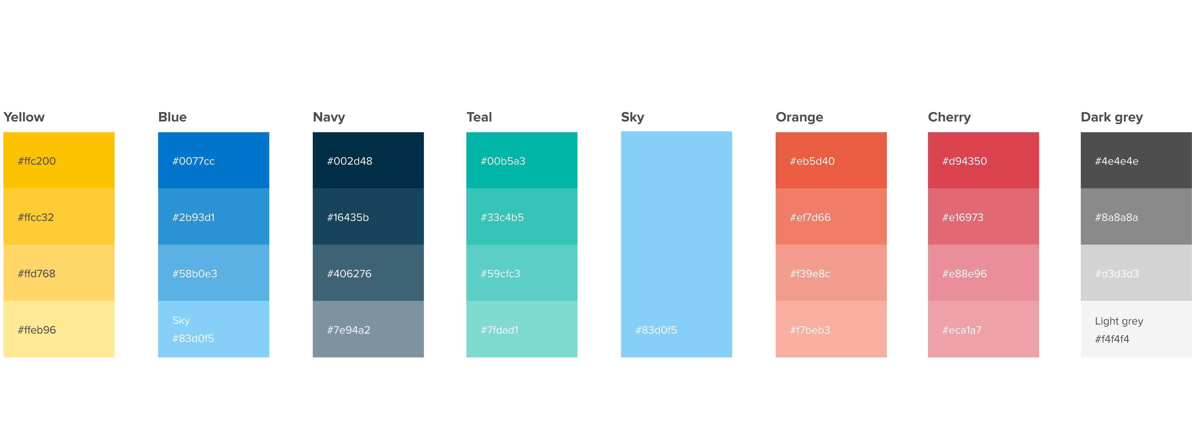
Continuity being important, we didn’t want to change too much about our color palette. Instead, we wanted to expand our set of colors in order to give ourselves more flexibility as we diversified our marketing activities (and swag collection).
To that end, we added three new accent colors to our palette:

Building a universe
Then we came to what was arguably the most exciting part of the whole exercise: our new mascots and their world.
Before the big unveil, a little context. In recent years, the B2B marketing world has come to better understand that at the end of the day, we’re all still selling to humans. What that means is that the considerations around emotion, brand and engagement that were previously assumed to belong more squarely in the B2C camp have begun to be recognised as just as important for B2B.
For us, that meant that we wanted to build a creative landscape around Yieldify that was imaginative, playful and full of the kind of warmth and friendliness that we believe to be at the core of who we are as a business.
The development of this idea started with a new ambassador – a character that would embody our values, our ambitions and our attitude. After hundreds of Slack arguments over her name, Sky was born:

So, why a female astronaut to represent a marketing technology company? The answer goes back to our central message: journeys. Sky explores and charts new courses not just in this universe, but in others too. On top of that, she humanizes and personalizes the process and the experience the way we do as we work with our clients.
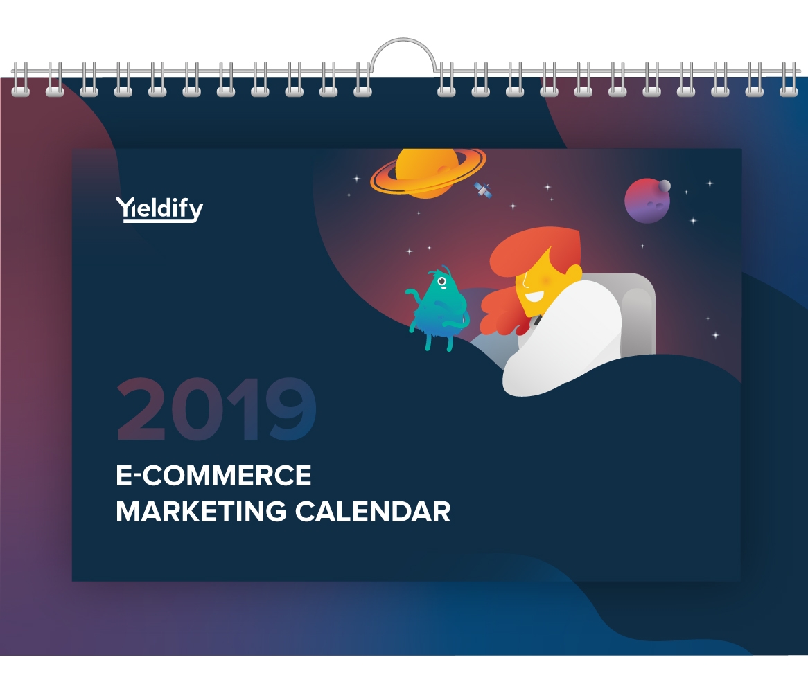
With Sky in place, the rest of our universe began to form around her. A colourful, multi-dimensional landscape of colours and iconography that provided us with a whole new playground of elements to translate across every Yieldify touchpoint. From the popsockets that adorn all of our phones to the 2019 e-commerce calendar that now features an LGBTQ+ alien, we built out a wide range of elements that mean every element of your interaction with Yieldify offers something new:

Launching our new brand
As a business operating in four countries with clients in dozens more, we decided to phase our new brand and messaging rollout in order to make the transition more manageable. With Sky and friends appearing in new materials since the end of 2018, the launch has culminated in today’s launch of our brand new website. We’re all-new for 2019.
We look forward to hearing your thoughts and questions about our new branding. Check our events page to see where you can meet us in the coming year to see it all brought to life (and even take some of the new swag home with you).